-
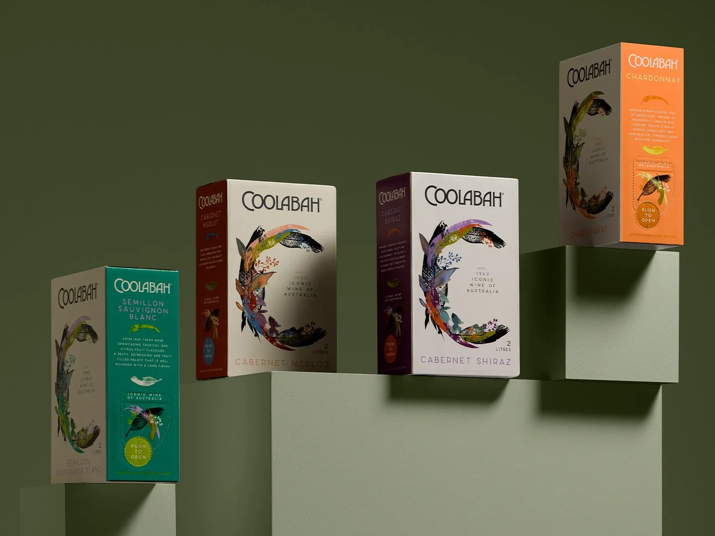
The design of a more sophisticated 2 Litre offering brings the Coolabah brand from 1962 to 2022! To create an evolution from the current branding the brief involved retaining the current logo type. By subtly changing the weight it gave to a more contemporary look without looking out of place. The “C” has been created from Australian bush leaves and flora to emphasis the brand's origin and the muted colour palette creates a sophisticated feel.
The front of the cask has been designed to look like a book cover. Lined up on the shelf in-store, the brand creates a point of difference to its competitors. Seen from a distance, it immediately draws the consumer to the product.
The side of the cask has been considered since this will be viewed mostly by the consumer after purchase.


Previous
Previous
Three Chain Road – Gin Range
Next
Next